Table of Contents
Adaptive Mobile App Trends for Foldables, Tablets, and Connected Screens
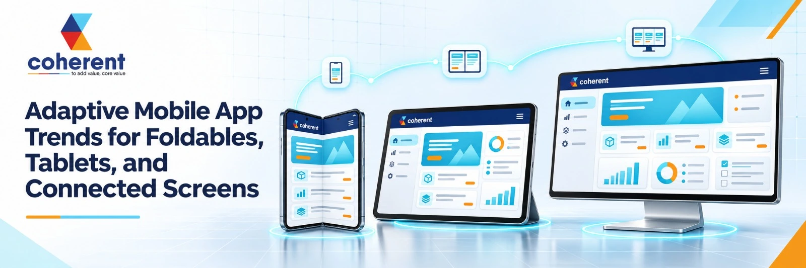
Mobile app development is moving beyond traditional smartphone screens. Foldable phones, tablets, desktops, smart displays, and connected devices are changing how people interact with applications. Businesses must now invest in adaptive mobile app development to deliver consistent, flexible, and user-friendly experiences across different screen sizes, orientations, and device environments.
Adaptive mobile app development is the process of designing applications that automatically adjust their layouts, navigation, and functionality to different screen sizes and device capabilities. As foldable smartphones, tablets, and connected screens become more important, businesses need flexible app architectures that provide seamless experiences across devices without compromising usability, performance, or accessibility.
Why Are Adaptive Mobile Apps Becoming Important?
Adaptive mobile apps are becoming essential because users no longer depend on a single device to complete their daily activities. Someone might start reading a document on a smartphone, continue editing it on a tablet, and finish the task on a desktop.Traditional mobile applications often struggle with these transitions because their interfaces are designed primarily for fixed screen dimensions.Adaptive app development addresses this challenge by making applications responsive to available screen space, device capabilities, and user interactions.
- Foldable smartphones: Applications need to adjust when users open or close their devices.
- Tablets: Larger displays require better navigation, multitasking, and content organization.
- Desktop environments: Mobile applications may need to support resizable windows and keyboard interactions.
- Connected screens: Users expect consistent experiences across compatible displays and devices.
What Is Adaptive Mobile App Development?
Adaptive mobile app development is an approach to building applications that automatically modify their interface and behavior according to available screen space, device configurations, and user interaction methods. Unlike traditional applications that use nearly identical layouts across devices, adaptive applications can provide different interface arrangements while maintaining the same core functionality. Businesses looking to create flexible and scalable digital experiences can partner with a reliable Mobile App Development Company like Coherent Lab LLP to build applications that deliver consistent performance across smartphones, tablets, foldable devices, and other supported platforms.
- A single-column product listing on a smartphone.
- A two-column product browsing experience on a foldable phone.
- A product listing and shopping cart side by side on a tablet.
- A wider shopping workspace with additional product information on a connected desktop display.
10 Adaptive Mobile App Trends Shaping Foldables, Tablets, and Connected Screens
Adaptive mobile app development is transforming how businesses design digital experiences across smartphones, foldable devices, tablets, desktops, and connected displays. Modern users expect applications to adjust seamlessly to different screen sizes, orientations, and interaction methods without compromising usability or performance. To build applications that deliver reliable performance across Android smartphones, tablets, and foldable devices, businesses can partner with an experienced Android App Development Company like Coherent Lab LLP. The right development approach helps create scalable Android applications with responsive interfaces and seamless user experiences.
1. Foldable Smartphone App Optimization
Foldable smartphones are changing how users interact with mobile applications by introducing multiple screen configurations within a single device. Applications must respond intelligently when users fold, unfold, or partially open their smartphones. Instead of relying on fixed layouts, developers should create flexible interfaces that adjust to changing screen dimensions and device postures. This approach helps maintain usability, improve multitasking, and provide consistent experiences across cover screens and larger displays.
- Folded and unfolded layouts: Display essential features on smaller cover screens and provide additional content when the device is unfolded.
- Hinge-aware interfaces: Position important buttons, text, and interactive elements away from areas obstructed by the device hinge.
- Book posture support: Organize content into separate sections for comfortable reading, browsing, and multitasking.
- Tabletop posture support: Position video content on the upper display while keeping playback controls and interactive elements accessible below.
2. Tablet-First Application Experiences
Tablet-first application design focuses on utilizing larger screens to deliver more productive and content-rich digital experiences. Unlike smartphones, tablets provide additional space for dashboards, navigation panels, reports, and multiple content sections. Simply stretching a smartphone interface across a tablet display can create poor usability. Businesses should prioritize tablet-friendly layouts when users perform complex tasks, manage information, or interact with applications for extended periods.
- Split-screen layouts: Allow users to browse information while editing documents or managing other activities.
- Advanced dashboards: Display charts, reports, analytics, and business information within organized screen sections.
- Flexible orientation: Support both landscape and portrait modes without disrupting the application experience.
- External accessory support: Improve productivity through compatible keyboards, styluses, and other connected accessories.
3. Seamless App Continuity Across Devices
Cross-device app continuity allows users to move between smartphones, tablets, and desktops without losing their progress. Modern consumers expect their preferences, documents, shopping activities, and application data to remain synchronized across supported devices. For example, a customer might browse products on a smartphone, compare options on a tablet, and complete a purchase through a desktop interface. A connected application experience reduces interruptions and makes digital interactions more convenient.
- Automatic progress saving: Preserve documents, settings, and application activities when users switch devices.
- Shared shopping carts: Keep selected products, saved items, and customer preferences synchronized.
- Cross-device notifications: Deliver relevant updates and activity alerts across supported platforms.
- Secure data synchronization: Protect user information while maintaining consistent access across connected devices.
4. Multi-Window and Split-Screen Mobile Applications
Multi-window and split-screen functionality is becoming increasingly important for adaptive mobile applications, particularly on tablets, foldable smartphones, and desktop-style environments. These capabilities allow users to manage multiple activities without constantly switching between application screens. Businesses can improve productivity by designing interfaces that support flexible window arrangements and simultaneous access to relevant information. This approach is especially useful for professional applications where users frequently compare data, communicate, and complete tasks.
- Customer management: Review customer profiles while responding to messages or support requests.
- Product comparison: Compare different products or services without repeatedly navigating between pages.
- Document editing: Work on documents while keeping reference materials visible in another window.
- Business monitoring: View operational information alongside financial reports and performance analytics.
5. Connected Display and Desktop-Style Mobile Experiences
Connected displays are expanding mobile application capabilities by allowing compatible smartphones and tablets to support larger screens and desktop-style workflows. Users can access applications through external monitors, larger windows, and more flexible navigation systems. Android 16 QPR3 introduced general availability of connected display support in March 2026, creating additional opportunities for developers to explore external-display experiences. Businesses should consider these capabilities when developing productivity tools, enterprise applications, and professional software.
- Large-screen optimization: Arrange application content to make effective use of additional display space.
- Desktop-style navigation: Introduce suitable navigation panels, toolbars, and menu structures.
- Flexible content positioning: Allow users to organize application windows and information efficiently.
- External-display compatibility: Support relevant display configurations and workflows on compatible hardware.
6. AI-Powered Adaptive User Interfaces
Artificial intelligence is introducing new possibilities for adaptive user interfaces by helping applications personalize content according to user behavior, preferences, and context. Traditional adaptive design primarily responds to screen dimensions and device configurations, while AI can make the experience more relevant through intelligent recommendations and content prioritization. Businesses can use AI-powered features to simplify navigation, improve information discovery, and support personalized workflows while maintaining predictable layouts and user control.
- Personalized dashboards: Prioritize information based on user roles, preferences, and activities.
- Context-aware navigation: Suggest relevant application sections according to user behavior.
- Intelligent content organization: Arrange information to make frequently used features easier to access.
- Predictive recommendations: Provide relevant search suggestions, content recommendations, and workflow assistance.
7. Gesture-Based Navigation and Flexible User Interactions
As mobile applications expand across smartphones, tablets, and connected displays, supporting different interaction methods is becoming increasingly important. Users may prefer touch gestures for browsing, keyboards for writing, mice for precise selection, and styluses for drawing or editing. Adaptive applications should accommodate these different preferences without making navigation complicated. Supporting multiple input methods can improve accessibility, usability, and productivity across different devices and working environments.
- Gesture-based navigation: Support intuitive swiping, pinching, dragging, and other touch interactions.
- Keyboard shortcuts: Provide convenient shortcuts for frequently performed application tasks.
- Mouse and trackpad support: Enable accurate navigation and selection on larger displays.
- Stylus and voice controls: Support drawing, handwriting, editing, and voice-based interactions where appropriate.
8. Cross-Platform Development for Multiple Screen Sizes
Cross-platform application development helps businesses create applications for multiple operating systems while sharing significant portions of their codebase. Technologies such as Flutter and React Native support this approach, making it easier to manage development efforts across platforms. However, code sharing alone does not guarantee an adaptive user experience. Developers must also consider screen dimensions, platform-specific behavior, navigation patterns, and device capabilities to deliver consistent application performance.
- Reusable components: Build flexible interface components that adjust to different screen dimensions.
- Platform-specific navigation: Follow suitable design conventions for Android, iOS, and other supported environments.
- Responsive breakpoints: Adjust layouts according to available screen space and device configurations.
- Performance optimization: Maintain smooth application performance through efficient rendering and appropriate native integrations.
9. Accessibility-First Adaptive App Design
Accessibility-first design ensures that mobile applications remain usable for people with different abilities, preferences, and interaction requirements. An interface that works well on a standard smartphone may become difficult to navigate when users increase text sizes, change screen orientation, or connect external keyboards. Developers should incorporate accessibility into adaptive layouts from the beginning rather than treating it as a final development activity. This helps create more inclusive experiences across different devices and environments.
- Scalable typography: Support adjustable text sizes and Dynamic Type where applicable.
- Sufficient color contrast: Maintain readable text and clearly distinguish interactive elements.
- Screen reader compatibility: Provide meaningful labels and descriptions for interface components.
- Accessible navigation: Support keyboard controls, suitable touch targets, and clear interaction feedback.
10. Unified Experiences Across Smart Displays and Connected Devices
Connected screens are expanding mobile application development beyond traditional smartphones and tablets. Smart displays, televisions, external monitors, and other compatible devices can become additional touchpoints within a connected digital ecosystem. However, businesses should not assume that one interface will work equally well across every device. Each environment has different viewing distances, interaction methods, and technical requirements. Adaptive development helps businesses create consistent experiences while keeping each interface suitable for its intended purpose.
- Smart home dashboards: Manage connected appliances, lighting, security systems, and home settings.
- Healthcare monitoring displays: Present relevant patient information and monitoring data through suitable interfaces.
- Retail information screens: Display product details, promotional content, and interactive shopping information.
- Enterprise monitoring systems: Provide business analytics, operational dashboards, and performance information.
What Technologies Are Used to Build Adaptive Mobile Applications?
Developing applications for foldable smartphones, tablets, and connected screens requires a combination of modern frameworks, adaptive layout systems, and device integration technologies. Businesses looking to integrate intelligent features, personalized experiences, and advanced functionality can also explore AI App Development Company services from Coherent Lab LLP. The right development partner can help transform application ideas into scalable digital solutions that align with evolving business and user requirements.
Technologies Used for Adaptive Mobile App Development
|
Technology |
Primary purpose |
Best suited for |
|---|---|---|
|
Flutter |
Cross-platform UI development |
Applications targeting Android and iOS |
|
React Native |
Cross-platform mobile development |
Business and consumer applications |
|
SwiftUI |
Native Apple interface development |
iPhone and iPad applications |
|
Jetpack Compose |
Native Android UI development |
Foldables, tablets, and Android devices |
|
Jetpack WindowManager |
Fold and display information |
Foldable Android applications |
|
Kotlin |
Android application development |
Native Android experiences |
|
Firebase |
Backend services and synchronization |
Connected application experiences |
|
REST APIs |
Communication between applications and servers |
Cross-device data exchange |
How to Build an Adaptive Mobile App for Foldables, Tablets, and Connected Screens
Building an adaptive mobile application requires careful planning, flexible interface design, and compatibility with different device configurations. Businesses must consider how users interact with applications across smartphones, foldable devices, tablets, desktops, and connected displays. Businesses aiming to deliver consistent experiences across multiple platforms and screen sizes can benefit from professional Cross-Platform App Development services from Coherent Lab LLP. The right development strategy helps create flexible, scalable applications that maintain functionality and usability across supported devices while reducing development complexity.
Step 1: Understand Your Target Devices and Users
Start by identifying the devices your target audience regularly uses and understanding how they interact with your application. Different users may prefer smartphones for quick activities, tablets for productivity, and larger displays for complex workflows. Researching device preferences helps businesses prioritize development requirements and avoid unnecessary implementation costs. Instead of supporting every possible device immediately, focus on the platforms and screen configurations that provide the greatest value to your customers.
- Standard smartphones: Identify the screen sizes, operating systems, and common usage patterns of mobile users.
- Foldable smartphones: Consider folded, unfolded, and partially opened device configurations.
- Tablets and Chromebooks: Evaluate larger-screen requirements and productivity-focused interactions.
- Connected displays: Identify whether external monitors, desktops, or other connected devices are relevant to your application.
Step 2: Create Flexible UI and UX Designs
Create adaptive interface designs that respond to different screen sizes, orientations, and window configurations. A good design system should maintain consistent navigation while allowing content to reorganize according to available display space. Designers should prepare separate layouts for compact, medium, and expanded screens rather than simply stretching smartphone interfaces. Prototyping different device configurations also helps identify usability problems before development begins.
- Flexible grids and spacing: Create layouts that adjust naturally to different screen dimensions.
- Scalable typography: Maintain readable text across smartphones, tablets, and larger displays.
- Adaptive navigation: Organize menus and navigation elements according to available screen space.
- Multiple content panels: Support side-by-side information and flexible content arrangements where appropriate.
Step 3: Select the Right Development Framework
Selecting the right development framework is essential for building an adaptive application that meets performance, scalability, and maintenance requirements. Businesses should compare native and cross-platform technologies according to their target devices and development objectives. Flutter and React Native can support applications across multiple platforms, while Kotlin with Jetpack Compose offers native Android development capabilities. The final selection should reflect technical complexity, team expertise, integration requirements, and long-term product goals.
- Flutter: Supports cross-platform application development with flexible interface components.
- React Native: Allows developers to reuse application logic while integrating native platform capabilities.
- Kotlin: Provides native Android development capabilities and access to Android device features.
- Jetpack Compose: Helps developers create modern Android interfaces using declarative UI development.
Step 4: Implement Adaptive Layout Logic
Once the framework is selected, developers should implement layout logic that responds to available window dimensions and device configurations. Applications should automatically adjust navigation, content organization, and interactive elements when users resize windows or change device posture. Developers should also consider foldable-specific behavior, multi-window functionality, and state preservation. Avoid relying entirely on fixed screen dimensions or hardcoded device names because they can limit compatibility with future devices.
- Window size classes: Use available window dimensions to determine appropriate interface layouts.
- Dynamic layout changes: Rearrange content when screen dimensions or orientations change.
- Hinge and fold detection: Account for foldable device features when supported by the platform.
- State preservation: Maintain user progress and application information during configuration changes.
Step 5: Integrate Backend and Cloud Synchronization
Backend and cloud integration help applications maintain consistent information when users access them from multiple supported devices. Businesses can implement secure authentication, API connectivity, and cloud storage to make important data available across different environments. However, synchronization requirements depend on the application type. For example, a shopping application may need synchronized carts, while a document editor may require automatic saving and conflict resolution. The architecture should balance data consistency, security, performance, and operational costs.
- Secure authentication: Protect user accounts through reliable identity and access management.
- Cloud-based storage: Store application data securely and make it accessible across supported devices.
- API integrations: Connect the application with external services and backend systems.
- Offline data management: Allow suitable application features to work when an internet connection is unavailable.
Step 6: Test Across Different Devices and Configurations
Testing is essential to ensure that adaptive applications work consistently across different devices, screen sizes, and interaction environments. Developers should evaluate more than basic smartphone and tablet compatibility. Testing should include folded and unfolded configurations, window resizing, landscape orientation, and split-screen behavior. Google's adaptive app quality guidance provides useful recommendations for evaluating application experiences across large screens and foldable devices. Early testing helps identify layout problems, performance issues, and accessibility gaps before deployment.
- Folded and unfolded testing: Check interface behavior across supported foldable device postures.
- Orientation testing: Verify layouts in both portrait and landscape configurations.
- Window dimension testing: Evaluate application behavior when users resize or adjust windows.
- Multi-window testing: Confirm that split-screen and simultaneous application usage work correctly.
Conclusion
The growing variety of foldable smartphones, tablets, and connected screens is changing how businesses should approach mobile application development. A fixed smartphone interface may no longer be sufficient for applications that need to support modern workflows, multitasking, and larger display environments.Businesses should focus on adaptive layouts, seamless application continuity, accessible interactions, and scalable development architecture. The right combination of these capabilities can help create applications that remain useful across changing device configurations.
Coherent Lab LLP helps businesses plan and develop modern mobile applications with scalable architecture, user-focused interfaces, and cross-platform capabilities.Whether you are planning a new mobile application or upgrading an existing product for foldables, tablets, and connected screens, the right development strategy can help prepare your business for evolving device experiences. Connect with Coherent Lab's mobile app development experts to discuss your project requirements and development goals.
Frequently Asked Questions
Q1. What is an adaptive mobile application?
Ans.An adaptive mobile application is software designed to adjust its interface and layout according to the available screen space, device configuration, and user interaction methods. It can provide different experiences on smartphones, foldables, tablets, and supported desktop environments. For example, an application may display a single-column interface on a phone and a multi-panel dashboard on a tablet. Adaptive development improves usability by making better use of available screen space while maintaining consistent core functionality across supported devices.
Q2. How are adaptive apps different from responsive mobile applications?
Ans.Responsive applications primarily use flexible layouts that resize and rearrange according to screen dimensions. Adaptive applications can make more significant changes to navigation, content organization, and interface structure based on the available window size or device configuration. For example, a responsive shopping application might resize its product grid, whereas an adaptive shopping application might also introduce side navigation, product comparison panels, and an expanded checkout experience. Modern mobile applications frequently combine responsive and adaptive techniques to deliver better cross-device compatibility.
Q3. How do developers optimize mobile apps for foldable smartphones?
Ans.Developers optimize applications for foldable smartphones by supporting different display configurations, including folded, unfolded, and partially folded states. They should implement flexible layouts, account for hinge areas, preserve application state, and adjust navigation when available screen space changes. Developers can use Android Jetpack WindowManager and adaptive Compose APIs to access relevant folding information. Testing should include different orientations and foldable postures. The objective is to ensure users can continue their activities without encountering broken layouts, inaccessible controls, or unexpected application interruptions.
Q4. Why should businesses develop tablet-compatible mobile applications?
Ans.Tablet-compatible applications allow businesses to provide more productive and comfortable experiences on larger screens. They can display additional information, support multitasking, improve content organization, and accommodate external keyboards or styluses. For example, a CRM application can display customer records alongside communication history, while an educational application can show learning material and notes simultaneously. Businesses should consider tablet optimization when their target customers regularly use tablets for professional, educational, entertainment, or productivity-related activities.
Q5. Which frameworks are best for adaptive mobile app development?
Ans.Flutter, React Native, SwiftUI, and Jetpack Compose are useful technologies for developing applications across different device environments. Flutter and React Native support cross-platform development, while SwiftUI and Jetpack Compose provide native interface development for Apple and Android platforms, respectively. Android developers can also use Jetpack WindowManager to access foldable display information and support adaptive layouts. The best framework depends on the application's technical complexity, platform requirements, development team's expertise, performance expectations, and long-term maintenance strategy.
Q6. What is app continuity in foldable and multi-device applications?
Ans.App continuity means preserving a user's current activity when an application experiences changes such as folding, unfolding, rotating, or resizing its window. For example, someone reading an article on a foldable phone should not lose their reading position when opening the device. Cross-device synchronization extends the idea by making relevant information available on separate devices through backend services. Developers should implement appropriate state management, data synchronization, and secure storage mechanisms to maintain a consistent experience without unnecessarily interrupting user activities.
Q7. What are the biggest challenges of building applications for multiple screen sizes?
Ans.The main challenges include maintaining consistent layouts, managing different device configurations, supporting multiple input methods, preserving application state, and testing across different screen sizes. Foldable devices introduce additional considerations such as hinge positioning and changing screen postures. Connected displays may require resizable windows and desktop-style navigation. Businesses can manage these challenges through reusable UI components, adaptive layout systems, platform-specific testing, and modular application architecture. Careful planning during the design stage also helps reduce unnecessary development complexity.
Q8. What is the future of adaptive mobile app development?
Ans.The future of adaptive mobile app development will involve more flexible interfaces, improved foldable support, connected display experiences, AI-assisted personalization, and better integration across device ecosystems. Applications will increasingly need to accommodate different screen sizes and interaction methods without sacrificing usability. Businesses will also need to prioritize accessibility, privacy, performance, and consistent application behavior. Rather than designing exclusively for smartphones, development teams should consider how their products can provide meaningful experiences across the devices their customers actually use.

 +91 774-202-1725
 +1 (945) 3387904
 business@coherentlab.com
 +49 15223341304
 UK